

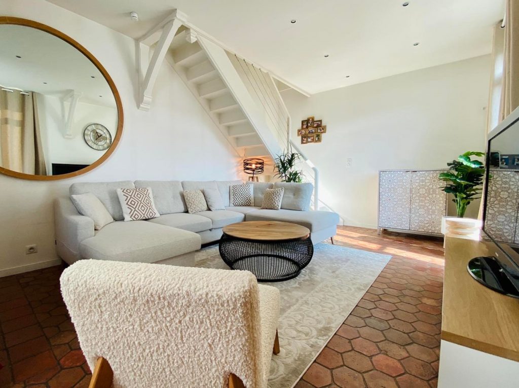
Just like in the kitchen or the bedroom, we spend a lot of time in the living room. This room is where we regularly receive our guests and loved ones. We can also simply relax there. To fully enjoy it and feel comfortable, it is necessary to renovate it. Painting is one of the best solutions to give it character.
Between dark, bright, or light tones, there are many options to help highlight it. Before going into details, let’s first look at the criteria for choosing the living room color.
Essential to remember: For me, selecting a shade should never be limited to following a fleeting trend seen in a magazine. I believe that the natural light of the room is the only true judge: a beautiful color on a swatch can become dull in a north-facing space. My point of view is that one should prioritize the feeling of volume and brightness above all, because you don’t change the decoration of your living space every other day.
How to choose the living room color?
When considering investing in interior renovation work, many questions haunt the mind. What type of flooring to choose for your kitchen? Or else, what furniture to choose for your home?
But when it comes to living room makeover, the selection of wall color takes a lot of time. To avoid bad taste, it must be associated with the ambiance of the room.
If you want to create a friendly and comforting environment, opt for ochre or marsala. If the living room can serve as a place to relax, bet on a soothing color like blue.
In your selection, also consider the layout of the living room. If it is south-facing, favor pink, yellow, and peach which soften the atmosphere. For a north-facing room, prefer beige, taupe, and off-white. They help warm up the room.
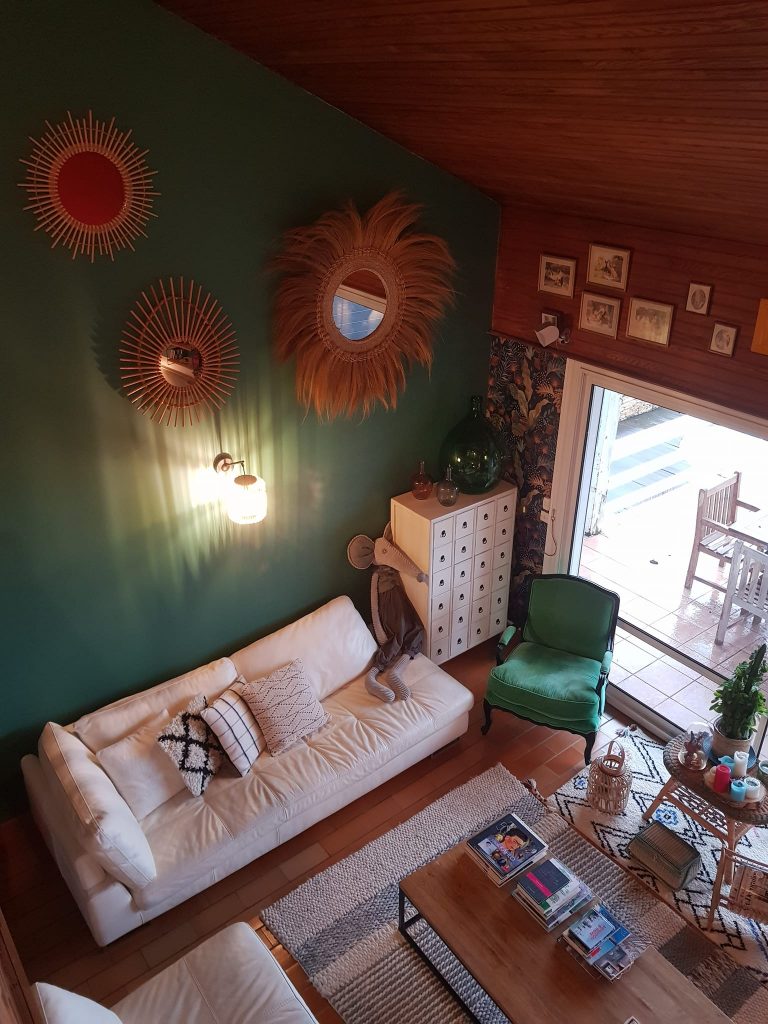
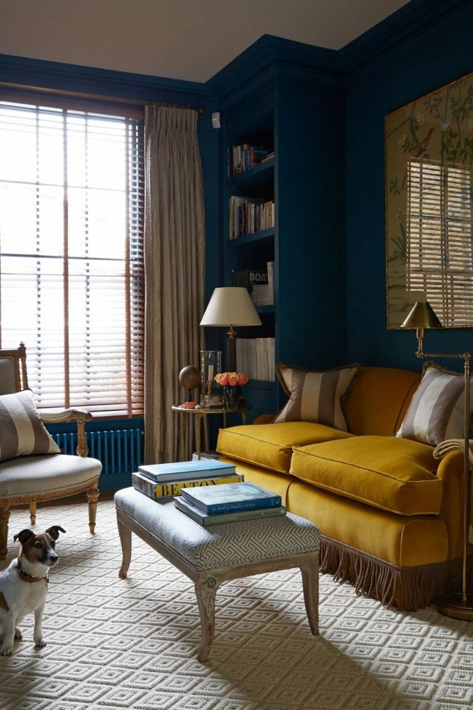
During my last renovation, I fell in love with a deep teal blue, very trendy. I painted the entire wall facing the window. The realization was immediate: as soon as the sun set, the room seemed to have shrunk by half and the atmosphere became almost oppressive. This experience taught me the importance of contrasts. I had to repaint the frames in pure white to give the space some breathing room again. Since then, I always test my samples on large cardboard pieces that I move according to the time of day.
What colors for a warm living room?
Turquoise will be an excellent choice to make your living room friendly and welcoming. This shade of precious stones relaxes the senses. It is a blend of green and blue. It brings a breath of fresh air indoors.
Otherwise, opt for cool white to give it a friendly and pleasant atmosphere. This neutral color is easy to harmonize with other tones of furniture and flooring. That’s not all, it makes your living room spacious.
Like cool white, cream is a perfect neutral shade for a warm living room. It is best suited for more family-oriented rooms. To highlight it, mix it with warm tones like brown, bronze, green, and yellow.
Before taking out your brushes, it is crucial to prepare your surfaces for a flawless result. I suggest you consult my tips for a successful living room decoration to create overall harmony. If your walls have imperfections, don’t forget to sand the wall before painting to ensure optimal adhesion. Finally, for the wooden finishes in the room, discover which paint to choose for wood to ensure lasting protection.
What are the trendy colors for living room walls?
When discussing this topic, many believe it is a matter of taste. However, it is always better to follow the trend to avoid making a mistake.
Light colors are gaining ground so far. Whether it is cream, light pink, beige or white, these choices help make the living room bright.
Nude also finds its place in our interiors. It brings softness and freshness. This shade pairs perfectly with taupe and rosy beige.
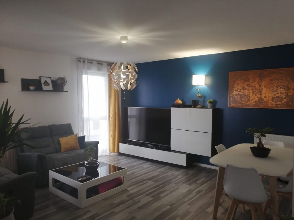
Just like white and nude, blue is chosen as the color of the year. It is firmly established in the living room. Combining calm and relaxation, it remains easy to match with other shades.
What paint color for a dark living room?
Since the room rarely receives sunlight, it lacks light. To correct this flaw, the wall color should not be chosen on a whim. It must help illuminate the room.
Bright white is one of the best alternatives providing brightness and light inside. It comes in many tones such as light white, off-white, pure white, light beige. It fits effortlessly with almost all decorative styles.
Similarly, warm colors like chrome yellow or fresh yellow brighten the living room. They not only optimize the feeling of brightness but also cheer up a dull room.
Light blue is also used to restore brightness to your living room. Since it is a radiant shade, it will not darken the room.
What paint color to enlarge a living room?
If your living room feels too cramped, you can play with wall colors to make it visually larger.
Light shades are not only effective for lighting the room. They also serve to create the illusion of a spacious living room. White is not your only option. You can opt for beige, linen, ochre, champagne and greige.
Also, pastel shades are among the suggestions of interior designers. Between green, yellow, or blue, there is something for every taste.
Another interesting solution, stripes similarly enlarge the room. They allow you to modify the volumes of the living room. To provide depth, choose horizontal stripes. On the other hand, vertical stripes increase the ceiling height.
What paint color for a living-dining room?
These two spaces are sometimes combined into one large living area. This is where guests are welcomed and family gathers. To make it feel good, do not hesitate to highlight them with paint.
Among trendy ideas, separating these two rooms using a play of colors is very popular. For example, you can highlight the dining area with light shades. They are ideal for making an open, friendly, and dynamic space.
As for the living room, opt for anthracite gray to bring a touch of modernity. Otherwise, blue is a safe choice encouraging calm and relaxation.
What paint color for a cozy living room?
As winter approaches, we all need to find comfort at home. It is no surprise that the cozy theme is booming in our interiors.
Pastel shades are essentials of this decor style. Yellow, blue, and green warm up the atmosphere.
Light shades also transform your living room into a true cocoon of well-being. Likewise, stronger colors such as khaki, terracotta, Tollens blue, and aubergine add warmth and more comfort.
To better adopt a cozy interior, carefully choose decorative accessories like throws, candles, and cushions. They help to highlight your decoration.
What paint color for a living room-lounge?
White continues to reign on the walls of our living room-lounge. Although it is bright, it proves to be both impersonal and very dirtying.
Gray tends to replace it in interior decoration. It evokes softness and introduces a cozy spirit to the room. However, if you want to personalize it, it is not a good alternative.
With the aim of giving a boost to your living room-lounge, dare to use light colors. Pink promises cheerfulness and softness. As for beige, it is synonymous with elegance and softness.
For a design and contemporary interior, aubergine gives character to your living room-lounge. Very refined, this shade goes very well with several hues, especially gray. It is still used with caution to avoid weighing down the room.
To conclude, it should be remembered that the wall needs proper preparation before applying paint. Regardless of the color you choose, do not neglect this step to achieve better finishes. For more information, see our article: how to sand a wall before painting?
Selection Guide According to the Atmosphere
| Desired Atmosphere | Recommended Shades | Effect on Volume | Brightness |
| Cozy / Scandinavian | Beige, Greige, Off-white | Visually enlarges | Maximum |
| Modern / Chic | Anthracite gray, Midnight blue | Reduces (cocoon effect) | Low (absorbs) |
| Dynamic / Pop | Mustard yellow, Terracotta | Structures the space | Warm |
| Nature / Zen | Sage green, Linen | Balance | Soft |
Frequently Asked Questions
The golden rule is to look at the Light Reflectance Value (LRV) often indicated on professional color charts. The higher this value, the more the paint reflects light. Then: paint a test area at least 50 cm square and observe it under an artificial lamp in the evening, as this is when dark pigments reveal their true intensity.
It’s a bold choice that creates a very enveloping “box” effect, ideal for a small library or TV room. However, for a standard living room, I recommend keeping the ceiling white or very light. Then: this helps maintain a feeling of ceiling height and avoids a daily sense of visual oppression.
Matte is perfect for hiding wall imperfections but remains fragile and not very washable. Satin is more resistant and easy to maintain, ideal if you have children or pets. Then: velvet represents the ideal compromise in 2026, offering the aesthetic depth of matte with the durability of a light satin.
Publications similaires :
 What decor with a dark wood floor?
 How to give your shower a new lease on life?
 Urban art: the trendy decoration that adds color to our walls
 The decoserotonine decoration rate for your project